Sunnywood's "Somewhere Over the Rainbow" Toned Morgans.
Article By: Sunnywood email This email address is being protected from spambots. You need JavaScript enabled to view it.
Taken from PCGS Collectors Universe message boards
"Sunnywood" has developed a classification system for Toned Morgans based on the spectrum produced by the thin-film interference phenomenon caused by the thickness of the silver-sulfide film (patination) on Toned Morgans. While not widely used by toned coin enthusiasts, this classification system is extremely helpful in understanding the toning progression of Rainbow Morgan dollars. It is also a useful chart to determine if your coin is artificial by not following the proper color progression.
What follows is a proposed new classification system that uses this color progression to describe the toning on our coins concisely.
I have listed and assigned classification codes to the colors typically found along the thin film progression.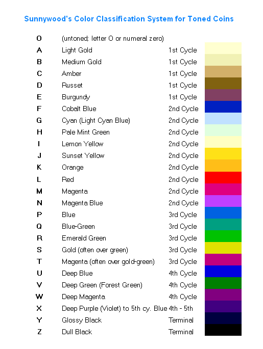 While in theory there are infinite gradations, and multiple possible color cycles, in practice the eye distinguishes certain colors, and after a few cycles the toning appears violet, then black. So I have tweaked the list to include the colors actually seen on heavily toned rainbow coins. Here then is a list of color classes:
Notice that I have reserved the letter "O" (alternately the numeral zero) for untoned. Otherwise I have used the whole alphabet in order. (The zero can be used instead of letter O in databases where we want to order the coins by toning classification; with the zero, a simple alphbetic sort will keep the untoned coins at the beginning of the list.)
The toning classification for one side of a coin will be one, two or three letters. If the context requires distinguishing between obverse and reverse, we can use an optional period "." in front of the obverse classification, and an optional slash "/" in front of the reverse classification.
For an untoned obverse the code is .0; for the reverse, /0. For a monochromatically toned obverse, "." followed by the appropriate single letter; for the reverse, slash followed by the appropriate single letter, such as /A for a coin reverse toned light gold. The entire coin can then be described as obverse
class -slash - reverse class. So a coin with a light gold obverse and untoned reverse would be A/0
This use of the slash is similar to the old style of assigning split grades to the two sides of a coin, such as 63/65.
If the obverse or reverse covers two or more color categories, use the lower toning limit, followed by the upper toning limit. For example, a coin whose obverse runs from untoned to cobalt blue would be 0F, light gold to cobalt blue would be AF, and light blue or cyan to emerald green would be GR. For the reverse, you can use the optional slash preceding the classification: /AE, and so on. For the entire coin, again the obverse, the slash, and then the reverse: 0C/AD, AG/BF, and so on.
Sometimes the toning makes a jump to one of the last three categories, typically after reaching at least emerald green (category R). In that case I would append the X, Y, or Z accordingly. So an obverse progressing all the way from light blue to glossy black, showing all the intermediate categories, would just be GY, but if it progresses from light blue to emerald green and then jumps to glossy black, it would be GRY. In this way, you could have classifications such as AC/BRX, or ERZ/AR, and so on.
For most toners, we talk about one side or the other, and most will fall into a two-letter classification, so we will talk about a coin that is AE, or 0R, or GR, etc. This has the consequence that some coins could receive toning classifications that look like other numismatic descriptors, such as AT, NT, PQ, AU, BU. That is why I'm suggesting using the dot or slash in front of the two-letter classification. Otherwise, you will have to make it clear in the context that "AT" means a coin toned from light gold to magenta, and not "artificially toned."
Here are some examples. I am using Morgan dollars here, but this system can apply equally to all toned silver coins. Thin film colors also appear on nickel and copper coins, and even gold occasionally. On copper, some of the colors are different because of the interaction with the reflected color of the copper itself.
The classification system is interesting and fun to apply. Here are a few examples of how this would work:
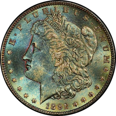
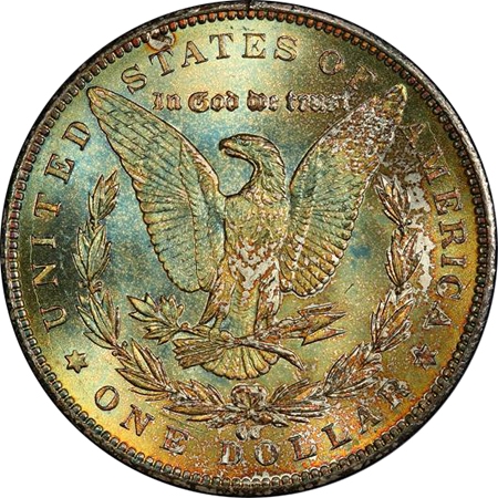
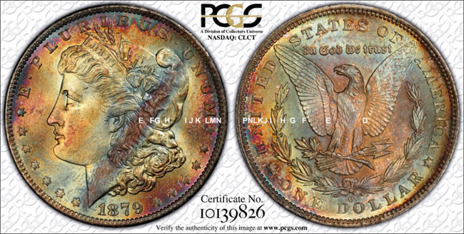
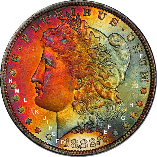
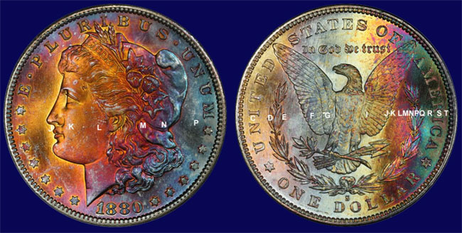
1892-CC PCGS MS66, obverse EH (burgundy in the recesses of the portrait through pale mint green), reverse FJ (cobalt blue through sunset yellow), whole coin is therefore EH/FJ. Some might argue the reverse goes to orange; that would be /FK. The toning classification can be somewhat subjective, just like grading. Sometimes the colors intermingle, and do not look like the corresponding colors on my chart. For example, this 1892-CC PCGS MS66
Morgan has an obverse that ranges from burgundy (E) in the recesses on the left edge of Miss Liberty's portrait, through cobalt blue and cyan, and into pale mint green with touches of color out to sunset yellow. So it is in the range from E to J. The reverse is a hair further along in the progression, with scattered cobalt blue (F) ranging out to orange (K). So the whole coin, both sides, falls in the range of E to K on the chart. But if you look at the chart, you'll see that it's a poor approximation of what the coin looks like. Still, the chart is very useful, and allows you to put the toning on this coin into the proper context.
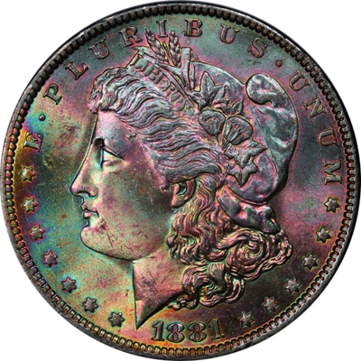
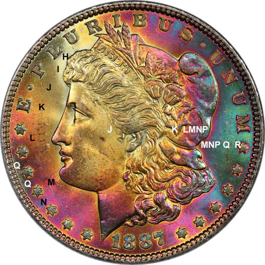
1881-O PCGS MS65, the "Purple People Eater," obverse ranges from sunset yellow at 9 o'clock to deep blue, for example at BUS of PLURIBUS, classification JU.
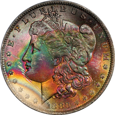
1883-O obverse from light gold at 7:30 thru emerald green, gold, magenta, but then jumping to glossy black, classification AMY
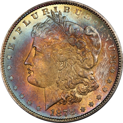
1878 7/8 TF Strong, obverse ranges from medium gold around Miss Liberty's ear and hair, thru amber, russet, burgundy, cobalt blue to cyan, but progresses further at the top to pale mint green or lemon yellow. I would call this BI (med. gold to lemon yellow).
This is like "paint by numbers" in reverse; you give me the painting, I fill in the numbers (ok, letters in this case). For those who say this system can't be used for a verbal description, here's my verbal description:
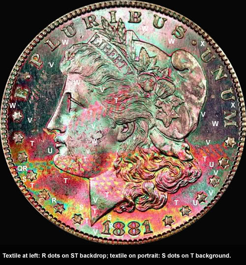
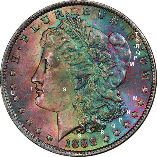
"A superb example of toning deep into the color progression, this coin exhibits copious fourth cycle colors (deep forest green and deep magenta) on the upper half, while vibrant class T magenta dominates the lower half. Small amounts of emerald green (class R) are seen between the digits of the date, and at stars 2-3-4-5. The remainder of the green on the coin is all forest green, class V. Textile in the left field sports emerald green dots on a gold/magenta backdrop (R dots/ST background), while on Miss Liberty's neck we see vibrant 3rd cycle gold dots on a magenta backdrop (S dots/T background). With toning ranging from class Q to class X, this coin demonstrates that even deep into the progression, we can have wild and vibrant colors on a classic bag-toned Morgan dollar."
The colors can be a little subjective, and the gradations are infinite, so just as two people can disagree on whether a coin is 63 or 64, there might be disagreement whether to call a particular color medium gold or amber ... so what I classify as BI might conceivably be called CI by someone else. But even though nothing is absolute, the classification still tells you a lot about the coin.
Note that artifically toned coins can still obey the standard progression, and there are also some naturally toned coins that do not. This can happen if there are unusual contaminants present during storage, perhaps such as chlorine, or excess sulfur. Such coins may fit our generally accepted notions of natural toning, while still exhibiting some unusual colors. But the vast majority of toned silver coins will conform to the standard progression.
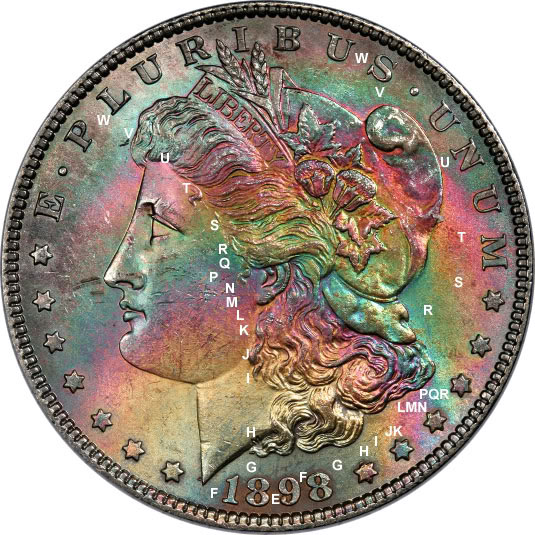
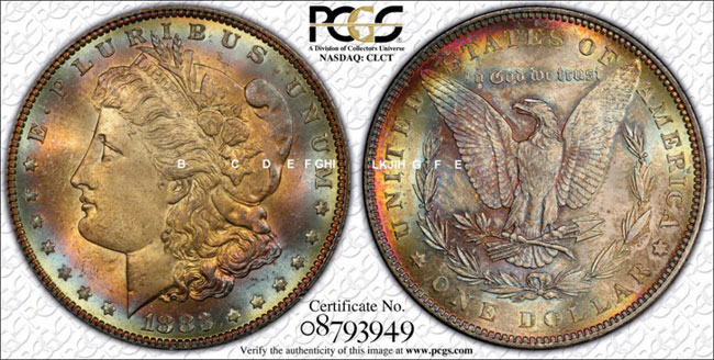
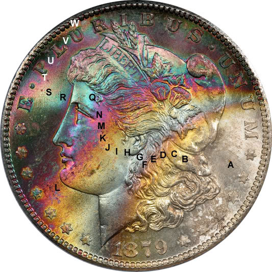
Here are some examples color mapped:
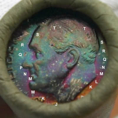
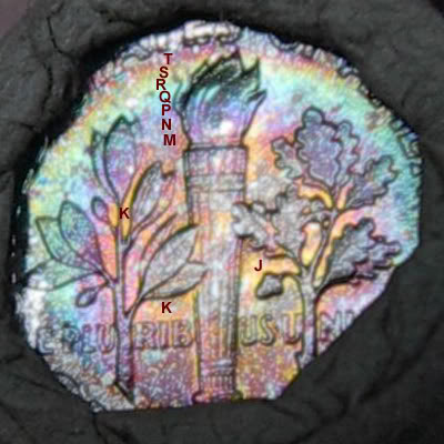
Small diameter coins can be a challenge, as there isn't enough room to have easily differentiable colors, and they tend to get more heavily toned in albums than their larger counterparts, as the peripheral rim toning reaches the center faster. But these two are easy:
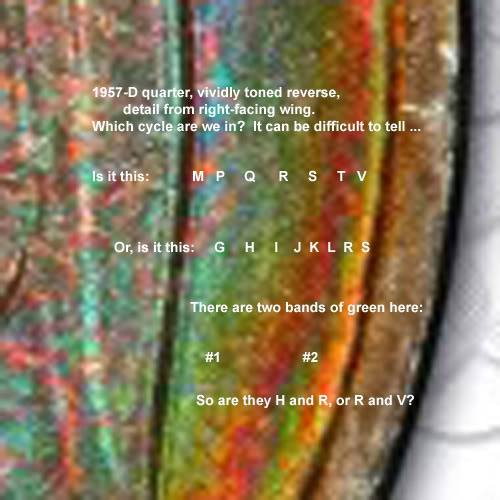
Moderns, especially those that were in the cellophane Mint set packaging, can get very vivid colors, and that can make it very difficult to determine which cycle you're in. On some moderns, the earlier cycle colors EFGH can be so vivid that they resemble later colors like MNPR. I have much more experience with Morgans and 19th century album-toned type, so I need to study more Washies and Frankies to understand the modern colors better. Here's an example of a detail from a 1957-D quarter, right-facing wing, that illustrates the problem (using your "microscopic notes" idea !!):
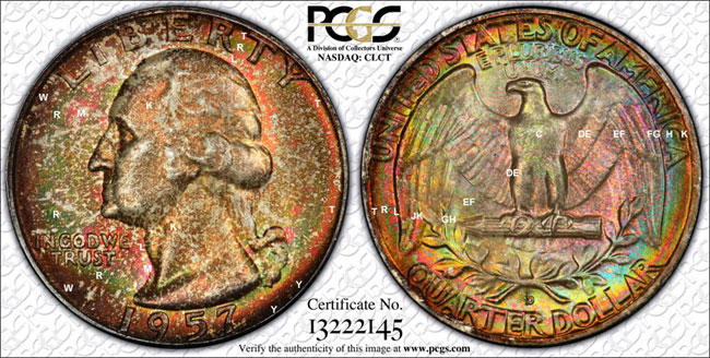
The answer, I think it is H and R, because to the right of band #2 we have a light gold, probably class S, which I wouldn't expect to see quite so clearly after class V.) Here's the whole coin, with my best guess as to what's actually happening:
The rim toning on the reverse is least at about 2 o'clock, where it only gets out to K or L (red), but as you go down the right rim, you see that thin red band move in from the edge. Down at DOLLAR it runs through the middle of the letters. Over on the left side, at U of UNITED, it is at the bottom of the U. Beyond the red band, you see a thin band of green (R), an then another red band (T). The bands are too narrow to label them all properly on the image.
Until I learn more and gain more experience, I am most comfortable on Morgans (because I have seen thousands of them), and less comfortable on moderns (because I have never collected toned moderns). Perhaps the worst series in terms of toning on silver is Peace dollars, due to some aspects of their manufacture.


